
CSS 练习
这里是记录 Odin Project 中的一些 CSS 基础部分练习题的笔记,因为本人对 CSS 的理解并不是很好…
Margin And Padding
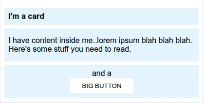
This one is a little nicer looking, and a little closer to something you might see in the real world. You’ll need to change a little more than just margin and padding to make it look exactly right.
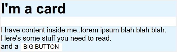
To:
Raw html and css are as below:
<!DOCTYPE html>
<html lang="en">
  <head>
    <meta charset="UTF-8" />
    <meta http-equiv="X-UA-Compatible" content="IE=edge" />
    <meta name="viewport" content="width=device-width, initial-scale=1.0" />
    <title>Margin and Padding exercise 2</title>
    <link rel="stylesheet" href="solution.css" />
  </head>
  <body>
    <div class="card">
      <h1 class="title">I'm a card</h1>
      <div class="content">
        I have content inside me..lorem ipsum blah blah blah. Here's some stuff
        you need to read.
      </div>
      <div class="button-container">and a <button>BIG BUTTON</button></div>
    </div>
  </body>
</html>
body {
background: #eee;
font-family: sans-serif;
}
.card {
width: 400px;
background: #fff;
margin: 16px auto;
}
.title {
background: #e3f4ff;
}
.content {
background: #e3f4ff;
}
.button-container {
background: #e3f4ff;
}
button {
background: white;
border: 1px solid #eee;
}:首先,Card内部的文字和Card边缘没有间隙,因此我们在Card内部创建一些留白:
.card {
  padding: 8px;
}
然后对于 .title,.container,.button-container,我们都创建一些留白、让它们不要挨在一起:
.title {
  margin-bottom: 8px;
  font-size: 16px;
  padding: 8px;
}

.content {
  margin-bottom: 8px;
  padding: 16px 8px;
}

.button-container {
  text-align: center;
  padding: 8px;
}
最后,为了让 button 独占一行并居中,我们让它变成块级元素 block,并且使用 margin: 0, auto 的居中技巧:
button {
  display: block;
  margin: 0 auto;
  padding: 8px 24px;
}
Flex-Header
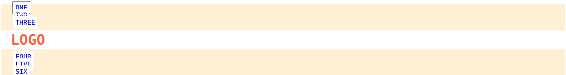
Use flexbox rules to create this very common webpage header style. The benefit to using flex here is that everything should be flexible. Check out the two screenshots below to get an idea of how it should scale with your screen. Besides flex rules, you’ll also want to add some rules for margin and padding.
To:

Raw html and css are as below:
<!DOCTYPE html>
<html lang="en">
  <head>
    <meta charset="UTF-8" />
    <meta http-equiv="X-UA-Compatible" content="IE=edge" />
    <meta name="viewport" content="width=device-width, initial-scale=1.0" />
    <title>Flex Header</title>
    <link rel="stylesheet" href="style.css" />
  </head>
  <body>
    <div class="header">
      <div class="left-links">
        <ul>
          <li><a href="#">ONE</a></li>
          <li><a href="#">TWO</a></li>
          <li><a href="#">THREE</a></li>
        </ul>
      </div>
      <div class="logo">LOGO</div>
      <div class="right-links">
        <ul>
          <li><a href="#">FOUR</a></li>
          <li><a href="#">FIVE</a></li>
          <li><a href="#">SIX</a></li>
        </ul>
      </div>
    </div>
  </body>
</html>
.header {
font-family: monospace;
background: papayawhip;
}
.logo {
font-size: 48px;
font-weight: 900;
color: tomato;
background: white;
padding: 4px 32px;
}
ul {
/* this removes the dots on the list items*/
list-style-type: none;
}
a {
font-size: 22px;
background: white;
padding: 8px;
/* this removes the line under the links */
text-decoration: none;
}:首先先让 .header 里面的东西水平排放并在竖直方向对齐。我们用 flex 容器,同时在主轴方向让项目均匀分布、交叉轴方向居中分布:
.header {
  padding: 8px;
  display: flex;
  align-items: center;
  justify-content: space-between;
}
现在变成下面这样了:

然后我们也对 ul 里面的东西用 flex 容器、让它沿水平方向排布。同时为了不让它们挨在一起,我们设置一定的 gap:
ul {
  display: flex;
  margin: 0;
  padding: 0;
  gap: 8px;
}
Flex-Header 2
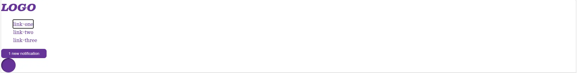
For this one you will probably need to edit the HTML a little bit. Often with flexbox you need to add containers around things to make them go where you need them to go. In this case, you probably want to separate the items that go on the left and right of the header.
To:

Raw html and css are as below:
<!DOCTYPE html>
<html lang="en">
  <head>
    <meta charset="UTF-8" />
    <meta http-equiv="X-UA-Compatible" content="IE=edge" />
    <meta name="viewport" content="width=device-width, initial-scale=1.0" />
    <title>Flex Header 2</title>
    <link rel="stylesheet" href="style.css" />
  </head>
  <body>
    <div class="header">
      <div class="logo">LOGO</div>
      <ul class="links">
        <li><a href="https://google.com">link-one</a></li>
        <li><a href="https://google.com">link-two</a></li>
        <li><a href="https://google.com">link-three</a></li>
      </ul>
      <button class="notifications">1 new notification</button>
      <div class="profile-image"></div>
    </div>
  </body>
</html>
/* this is some magical font-importing.
you'll learn about it later. */
@import url("https://fonts.googleapis.com/css2?family=Besley:ital,wght@0,400;1,900&display=swap");
body {
margin: 0;
background: #eee;
font-family: Besley, serif;
}
.header {
background: white;
border-bottom: 1px solid #ddd;
box-shadow: 0 0 8px rgba(0, 0, 0, 0.1);
}
.profile-image {
background: rebeccapurple;
box-shadow: inset 2px 2px 4px rgba(0, 0, 0, 0.5);
border-radius: 50%;
width: 48px;
height: 48px;
}
.logo {
color: rebeccapurple;
font-size: 32px;
font-weight: 900;
font-style: italic;
}
button {
border: none;
border-radius: 8px;
background: rebeccapurple;
color: white;
padding: 8px 24px;
}
a {
/* this removes the line under our links */
text-decoration: none;
color: rebeccapurple;
}
ul {
list-style-type: none;
}:这里我们需要先划分一下模块:最终结果中的 LOGO 和 link-one 这些都在左边、notification之类的在右边。因此我们要在html中把它们分成 .left 和 .right 两组:
<div class="left">
  <div class="logo">LOGO</div>
  <ul class="links">
    <li><a href="https://google.com">link-one</a></li>
    <li><a href="https://google.com">link-two</a></li>
    <li><a href="https://google.com">link-three</a></li>
  </ul>
</div>

<div class="right">
  <button class="notifications">1 new notification</button>
  <div class="profile-image"></div>
</div>
把它们放在两个flex中并在交叉轴方向居中:
.left,
.right {
  display: flex;
  align-items: center;
  gap: 16px;
}
之后就和前面的类似了:
.header {
  display: flex;
  justify-content: space-between;
  padding: 8px;
}

ul {
  display: flex;
  margin: 0;
  padding: 0;
  gap: 16px;
}
下面再来看一个模块划分的例子:
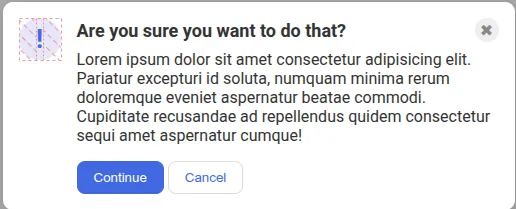
Flex Modal
This one is another very common pattern on the web. The solution to this one is simple… but it might not be immediately obvious to you. You’ll need to edit the HTML a bit to get everything where it needs to be.
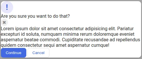
To:
Raw html and css are as below:
<!DOCTYPE html>
<html lang="en">
  <head>
    <meta charset="UTF-8" />
    <meta http-equiv="X-UA-Compatible" content="IE=edge" />
    <meta name="viewport" content="width=device-width, initial-scale=1.0" />
    <link rel="stylesheet" href="style.css" />
    <title>Modal</title>
  </head>
  <body>
    <div class="modal">
      <div class="icon">!</div>
      <div class="header">Are you sure you want to do that?</div>
      <button class="close-button">✖</button>
      <div class="text">
        Lorem ipsum dolor sit amet consectetur adipisicing elit. Pariatur
        excepturi id soluta, numquam minima rerum doloremque eveniet aspernatur
        beatae commodi. Cupiditate recusandae ad repellendus quidem consectetur
        sequi amet aspernatur cumque!
      </div>
      <button class="continue">Continue</button>
      <button class="cancel">Cancel</button>
    </div>
  </body>
</html>
@import url("https://fonts.googleapis.com/css2?family=Roboto:wght@400;700&display=swap");
html,
body {
height: 100%;
}
body {
font-family: Roboto, sans-serif;
margin: 0;
background: #aaa;
color: #333;
/* I'll give you this one for free lol */
display: flex;
align-items: center;
justify-content: center;
}
.modal {
background: white;
width: 480px;
border-radius: 10px;
box-shadow: 2px 4px 16px rgba(0, 0, 0, 0.2);
}
.icon {
color: royalblue;
font-size: 26px;
font-weight: 700;
background: lavender;
width: 42px;
height: 42px;
border-radius: 50%;
display: flex;
align-items: center;
justify-content: center;
}
.close-button {
background: #eee;
border-radius: 50%;
color: #888;
font-weight: 400;
font-size: 16px;
height: 24px;
width: 24px;
display: flex;
align-items: center;
justify-content: center;
border: 1px solid #eee;
padding: 0;
}
button {
cursor: pointer;
padding: 8px 16px;
border-radius: 8px;
}
button.continue {
background: royalblue;
border: 1px solid royalblue;
color: white;
}
button.cancel {
background: white;
border: 1px solid #ddd;
color: royalblue;
}:同样地,这里我们把 icon 和剩下的东西分成两个模块:
<!DOCTYPE html>
<html lang="en">
  <head>
    <meta charset="UTF-8" />
    <meta http-equiv="X-UA-Compatible" content="IE=edge" />
    <meta name="viewport" content="width=device-width, initial-scale=1.0" />
    <link rel="stylesheet" href="solution.css" />
    <title>Modal</title>
  </head>
  <body>
    <div class="modal">
      <div class="icon">!</div>
      <!-- additional container used here -->
      <div class="container">
        <!-- header div was moved to encompass the close button as well -->
        <div class="header">
          Are you sure you want to do that?
          <button class="close-button">✖</button>
        </div>
        <div class="text">
          Lorem ipsum dolor sit amet consectetur adipisicing elit. Pariatur
          excepturi id soluta, numquam minima rerum doloremque eveniet
          aspernatur beatae commodi. Cupiditate recusandae ad repellendus quidem
          consectetur sequi amet aspernatur cumque!
        </div>
        <button class="continue">Continue</button>
        <button class="cancel">Cancel</button>
      </div>
    </div>
  </body>
</html>
然后对相应的容器用 flex 即可。注意为了保持 icon 大小不变需要使用 flex-shrink: 0;:
/* SOLUTION: */

.modal {
  display: flex;
  gap: 16px;
  padding: 16px;
}

.icon {
  /* this keeps the icon from getting smashed by the text */
  flex-shrink: 0;
}
/* header container should be wrapped around the button element as well in order for flex style to work */
.header {
  display: flex;
  align-items: center;
  justify-content: space-between;
  font-size: 18px;
  font-weight: 700;
  margin-bottom: 8px;
}

.text {
  margin-bottom: 16px;
}